
Rearchitecting time in QuickBooks Online
Defining the future of time tracking for admins and business owners.
Client: Intuit
Role: Senior Product Designer
Date: Jun – Aug 2023
TL;DR
I led an audit of the Time experience in QuickBooks Online, which resulted in prioritization changes for the next fiscal year, identified over 80 critical usability bugs, and created a roadmap for the future of time tracking in the platform.
Overview
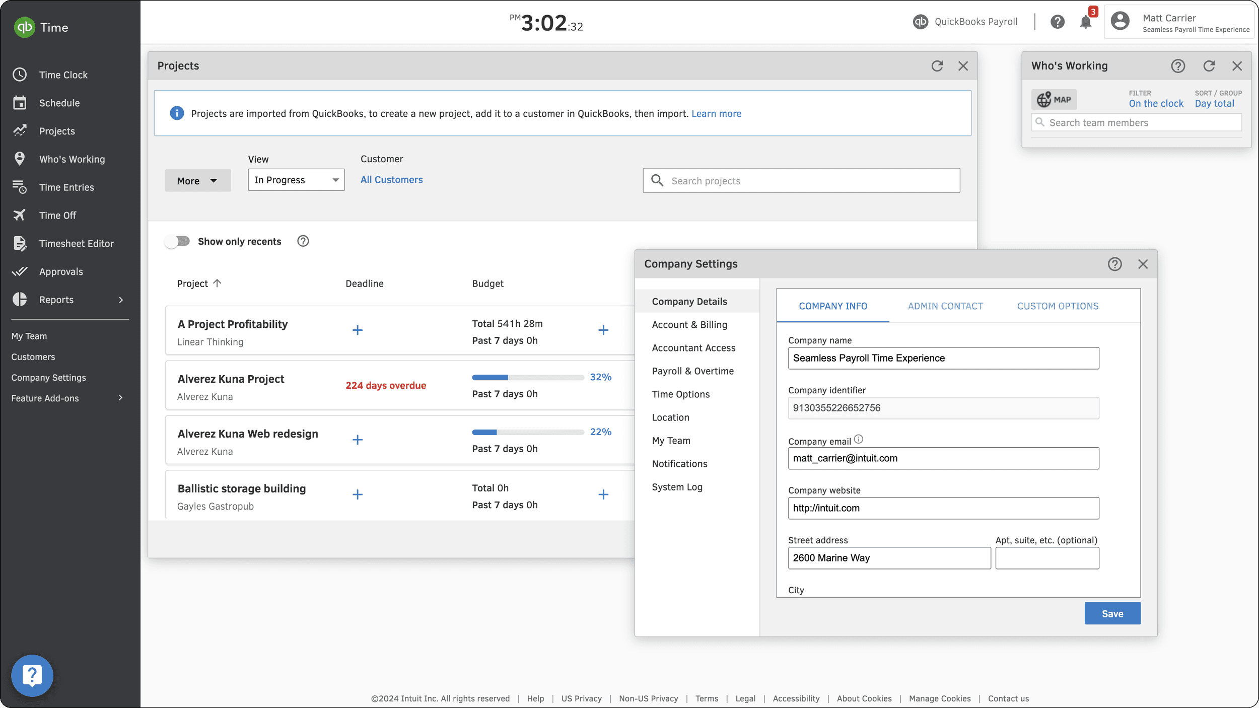
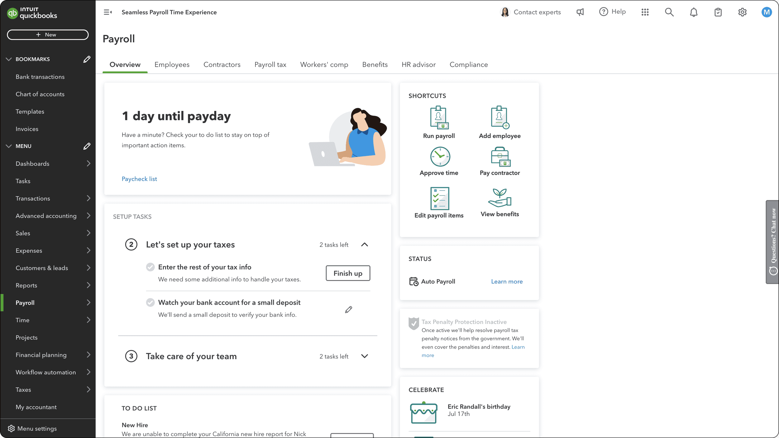
With the OTX (One Time Experience) initiative, features from QuickBooks Time Classic were quickly integrated into the QuickBooks Online product via the "Time" tab in the left navigation menu using i-frames. However, moving so quickly came at a cost—this experience wasn't tested or validated with customers. As soon as I joined the team, it became crucial to step back and explore how time tracking fits into the workflows of QBO admins.
QuickBooks Time (formerly TSheets)
QuickBooks Online
Early learnings and insights
When I joined the team at the end of Q3 FY23, it was crucial to collaborate closely with my PM, PD, and data partners. As I got up to speed, I learned the following:
The rapid implementation had sacrificed customer-backed design decisions.
Tracking OTX usage with i-framed experiences was difficult, and the team lacked a clear understanding of how and when features were being used in QBO.
This was more than just a Time issue—information architecture (IA) needed to be rethought across the Workforce teams (Payroll, Time, and HRIS).
As OTX (One Time Experience) was rolled out, it quickly became clear that early adopters were encountering serious discoverability and usability issues. Key takeaways included:
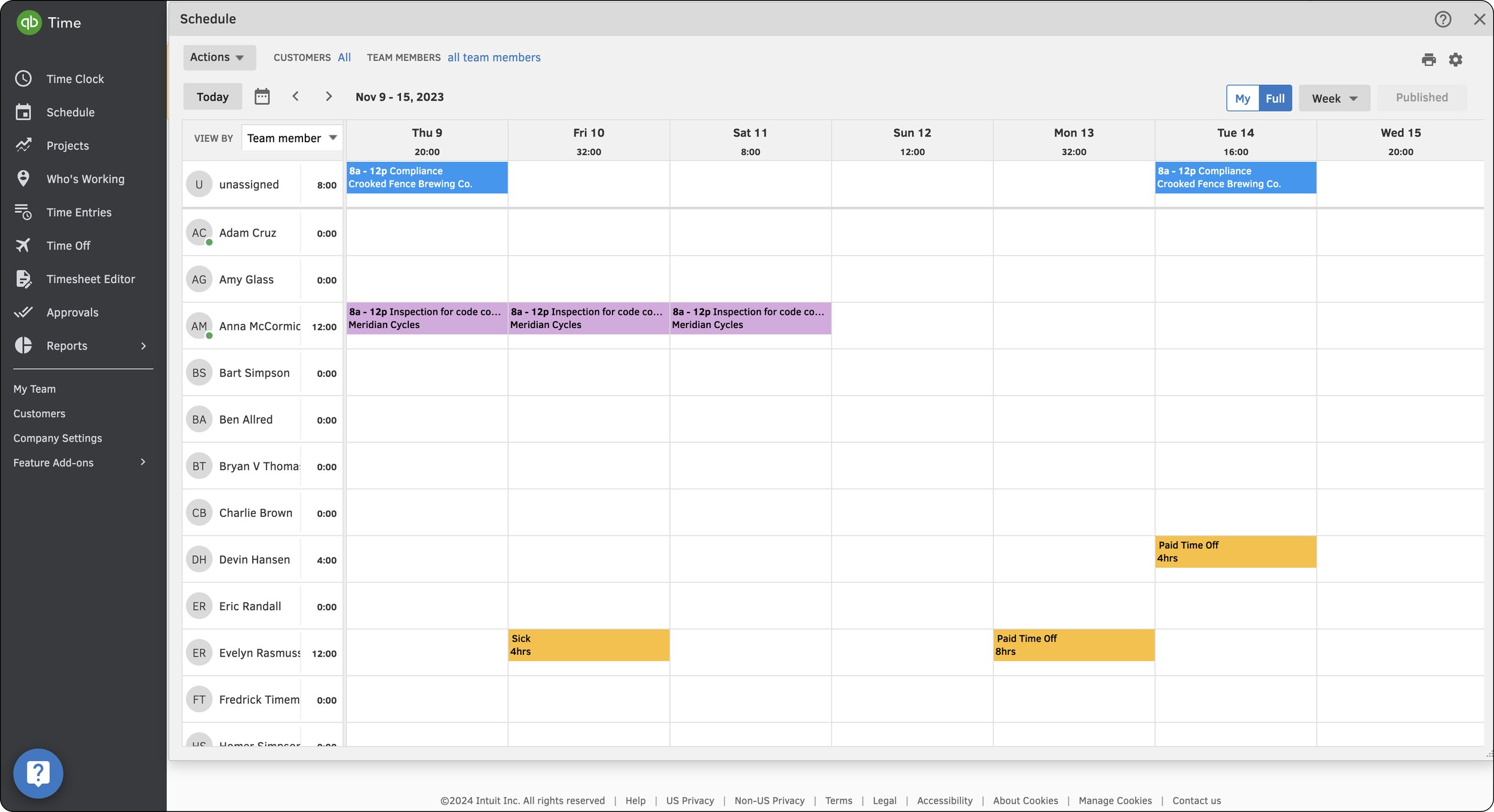
The most important workflows for admins were adding, editing/reviewing, and approving time.
Navigation and feature sets within the Time tab changed abruptly, causing confusion.
Sub-categories under the Time tab were unintuitive and didn't clearly represent their feature sets.
Due to these issues, customers were abandoning the i-framed Time experience in QBO and returning to the standalone Classic QB Time. Here’s an illustration of the challenges customers faced when accessing the schedule across both experiences:
One click to access in QuickBooks Time from the left nav
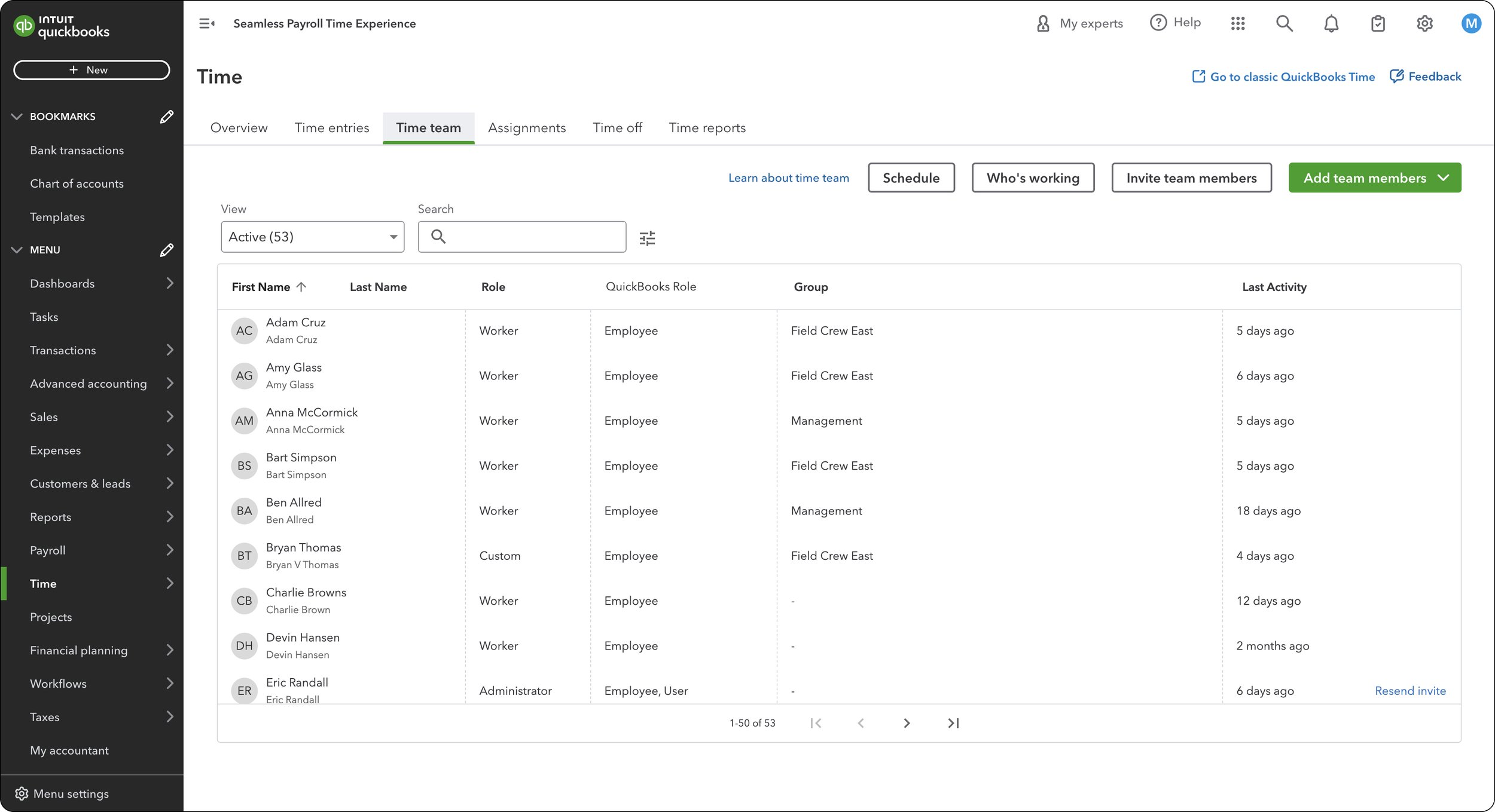
Three clicks to access in QBO with a full screen takeover
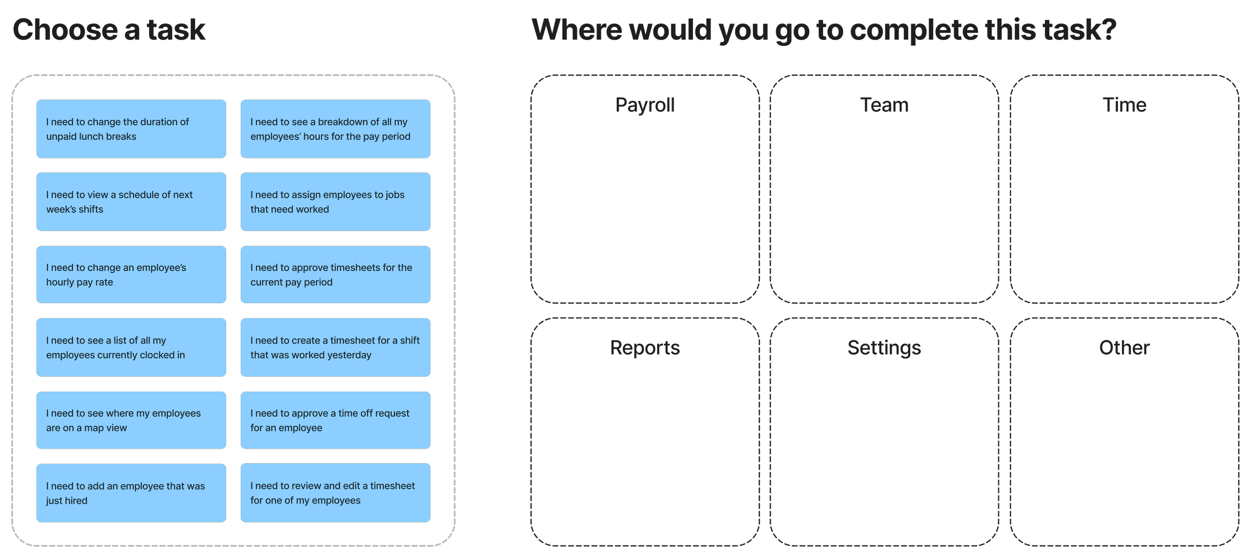
The research plan
Criteria:
10-15 business owners with at least 5 employees who use QBO for Payroll and need time tracking (either QB Time or a third-party solution).
60-minute interviews, split between a deep dive into product usage and a card sorting exercise.
What we want to learn:
Where do customers instinctively go to complete various time-related tasks within QBO?
What are the key time workflows that need to be prioritized for appFabric redesigns?
Deliverable:
A synthesized document of research findings and recommended feature set prioritization for FY24 and beyond.
Key research findings
50/50 for finding the scheduling and time off features in “Team” or “Time”
90% would expect to create, edit or view timesheets in “Time”
Timesheet management is also closely associated with running payroll
75% would go to “Team” to view current employee locations on a map view
80% would go to the “Reports” L1 tab instead of “Time” to run any time-related reports.
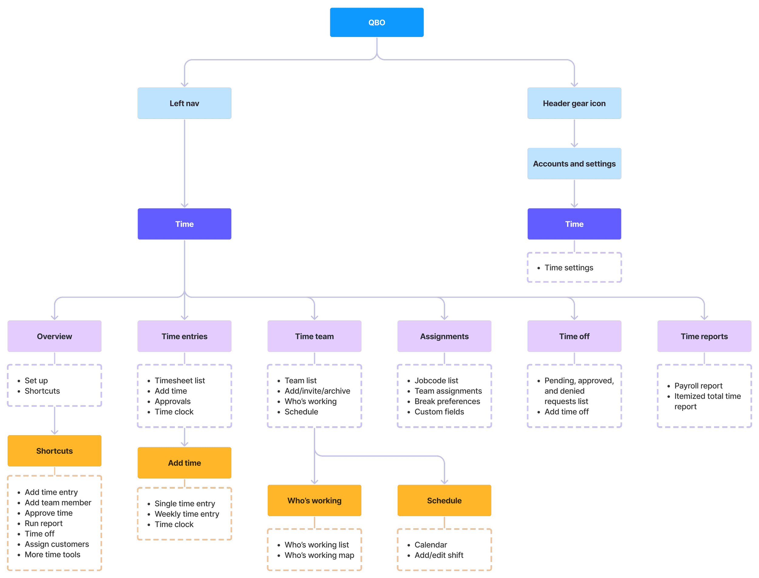
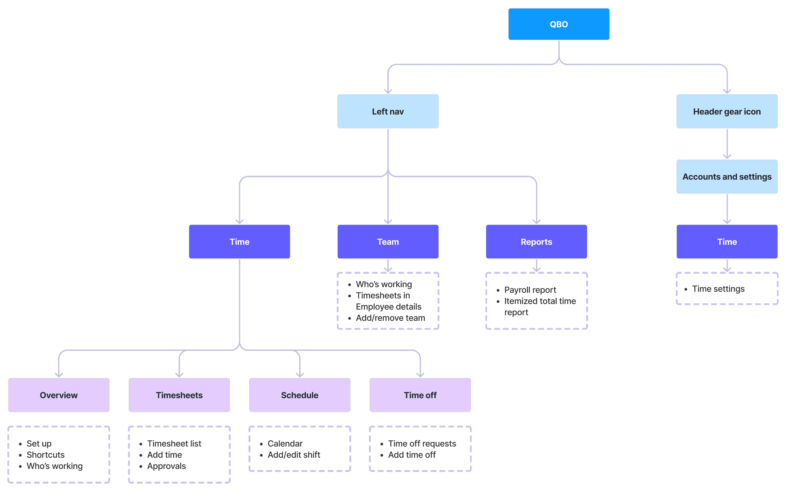
Proposed IA changes
The goal of this project was to create a roadmap for transitioning from a siloed, duplicative time tracking experience confined to one tab, to a customer-driven, integrated approach that aligns with the QBO ecosystem and meets users' workflow expectations.
Outcomes and next steps
The IA research study became the north star guiding multiple workstreams in the Time organization and driving usability improvements to key workflows.
I presented these findings to segment leadership, aligning on priorities and shaping the future of Time in QuickBooks.
In August 2023, I spearheaded a usability teardown of OTX, cataloging and prioritizing over 80 bugs in JIRA.
Key Time features are now being re-designed in AppFabric to replace the existing i-framed UX.
Following this project, I led a new initiative across three internal teams in the Workforce segment to develop a unified navigation strategy across product areas.
Rearchitecting time in QuickBooks Online
Defining the future of time tracking for admins and business owners.
Client: Intuit
Role: Senior Product Designer
Date: Jun – Aug 2023
TL;DR
I led an audit of the Time experience in QuickBooks Online, which resulted in prioritization changes for the next fiscal year, identified over 80 critical usability bugs, and created a roadmap for the future of time tracking in the platform.
Overview
With the OTX (One Time Experience) initiative, features from QuickBooks Time Classic were quickly integrated into the QuickBooks Online product via the "Time" tab in the left navigation menu using i-frames. However, moving so quickly came at a cost—this experience wasn't tested or validated with customers. As soon as I joined the team, it became crucial to step back and explore how time tracking fits into the workflows of QBO admins.
QuickBooks Time (formerly TSheets)
QuickBooks Online
Early learnings and insights
When I joined the team at the end of Q3 FY23, it was crucial to collaborate closely with my PM, PD, and data partners. As I got up to speed, I learned the following:
The rapid implementation had sacrificed customer-backed design decisions.
Tracking OTX usage with i-framed experiences was difficult, and the team lacked a clear understanding of how and when features were being used in QBO.
This was more than just a Time issue—information architecture (IA) needed to be rethought across the Workforce teams (Payroll, Time, and HRIS).
As OTX (One Time Experience) was rolled out, it quickly became clear that early adopters were encountering serious discoverability and usability issues. Key takeaways included:
The most important workflows for admins were adding, editing/reviewing, and approving time.
Navigation and feature sets within the Time tab changed abruptly, causing confusion.
Sub-categories under the Time tab were unintuitive and didn't clearly represent their feature sets.
Due to these issues, customers were abandoning the i-framed Time experience in QBO and returning to the standalone Classic QB Time. Here’s an illustration of the challenges customers faced when accessing the schedule across both experiences:
One click to access in QuickBooks Time from the left nav
Three clicks to access in QBO with a full screen takeover
The research plan
Criteria:
10-15 business owners with at least 5 employees who use QBO for Payroll and need time tracking (either QB Time or a third-party solution).
60-minute interviews, split between a deep dive into product usage and a card sorting exercise.
What we want to learn:
Where do customers instinctively go to complete various time-related tasks within QBO?
What are the key time workflows that need to be prioritized for appFabric redesigns?
Deliverable:
A synthesized document of research findings and recommended feature set prioritization for FY24 and beyond.
Key research findings
50/50 for finding the scheduling and time off features in “Team” or “Time”
90% would expect to create, edit or view timesheets in “Time”
Timesheet management is also closely associated with running payroll
75% would go to “Team” to view current employee locations on a map view
80% would go to the “Reports” L1 tab instead of “Time” to run any time-related reports.
Proposed IA changes
The goal of this project was to create a roadmap for transitioning from a siloed, duplicative time tracking experience confined to one tab, to a customer-driven, integrated approach that aligns with the QBO ecosystem and meets users' workflow expectations.
Outcomes and next steps
The IA research study became the north star guiding multiple workstreams in the Time organization and driving usability improvements to key workflows.
I presented these findings to segment leadership, aligning on priorities and shaping the future of Time in QuickBooks.
In August 2023, I spearheaded a usability teardown of OTX, cataloging and prioritizing over 80 bugs in JIRA.
Key Time features are now being re-designed in AppFabric to replace the existing i-framed UX.
Following this project, I led a new initiative across three internal teams in the Workforce segment to develop a unified navigation strategy across product areas.